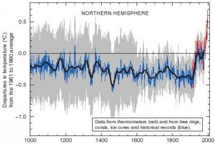

Despite the fact that Penn State professor Michael Mann’s famous “hockey stick” graph was long ago discredited, it still continues to be cited in study after study. In fact, it’s still the basis for the IPCC’s global warming hysteria.
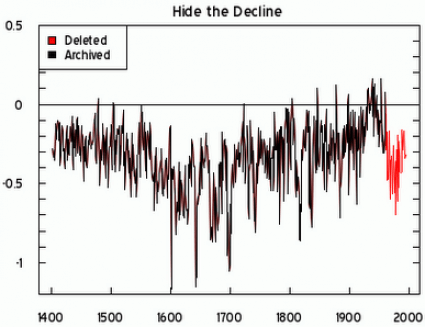
Unfortunately, there’s a damning comment in one of the ClimateGate emails that says: “I’ve just completed Mike’s Nature trick of adding in the real temps to each series for the last 20 years (ie from 1981 onwards) amd from 1961 for Keith’s to hide the decline.”
What does that mean? Well, here are two graphs that demonstrate the results of that “trick.” The top one shows Michael Mann’s original “hockey stick” chart complete with his tricks that hide the decline. The bottom one, known as the Briffa Reconstruction, removes the tricks and shows that global warming is, in fact, global cooling.
From now on, let’s just refer to it as “Mann-made” global warming.
Source: BluegrassPundit.com

